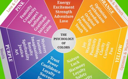
In this article, we explore ways colour can influence your brand message. While your brand message is primarily influenced by the words you use to convey your message, an equally important factor to consider is your brand. colours. The psychology of colour plays an important role in evoking an emotional response from your customers, therefore it is imperative that you consider your brand colours and choose colours that support your brand message.
For example, the colour blue is associated with trust, reliability and communication and it is not a coincidence that it the colour of choice for many big brands wanting to convey these messages, such as Facebook, Twitter, Barclays and Skype. It is important to ensure consistency across your branding and advertising materials from your website to your printed marketing materials.
Teaming your brand colours with good graphic design, strong copy and high quality print can help you convey your message in a concise and consistent way and can help improve your return on investment. Let’s take a look at some of the most common colours and the message they help to convey.
Black, White and Grey
Neutral colours are very effective when used in minimal print design, black is often associated with elegance and glamour and is often a common choice for luxury brands such as Chanel. This is usually teamed with white space to really enhance the feeling of luxury. Grey is used by brands wanting to perceived as high quality and professional such as Apple.
Red and Blue
Red is often the choice of colour for brands that want to denote energy and excitement, examples include Coca-Cola, Red Bull and Kellogg’s. As we mentioned earlier the colour blue has a long association with trust, reliability and trust and is often a popular choice for brands in the communication, technology and finance industries.
Pink and Purple
Pink denotes warmth, femininity and sensitivity and is often a popular choice for brands that target women and young girls, examples include Barbie, Cosmopolitan and Victoria Secret. With its regal association, purple denotes creativity and individuality and is the colour of choice for brands such as Cadbury, Hallmark and Yahoo!.
Green and Yellow
It may come as no surprise that green is used to evoke feelings of growth, vitality and being eco-friendly. Many brands choose green to help them position themselves as an environmentally friendly brand, examples of brands using green are Starbucks and The Body Shop. Yellow traditionally denotes youth, friendliness, happiness and optimism, examples of brands using yellow include McDonald’s, Chupa Chups and Snapchat.
While your colour choices may be influenced by your own personal colour preferences, it is important to consider the psychology behind each colour and align that with your brand to help convey your brand message.
Whatever your print requirements, the Lemon Press can promise the same high levels of attention and professional care for every job placed with us. Get in touch on 01527 510262 or email info@nulllemonpress.co.uk


